


When to use Flexbox?
In simple words, If you want to layout items in one direction on your webpage then you can use Flexbox.
Furthermore, I will explain to you in detail all the properties. Stay tuned for more information.
Difference between Flexbox and Grid
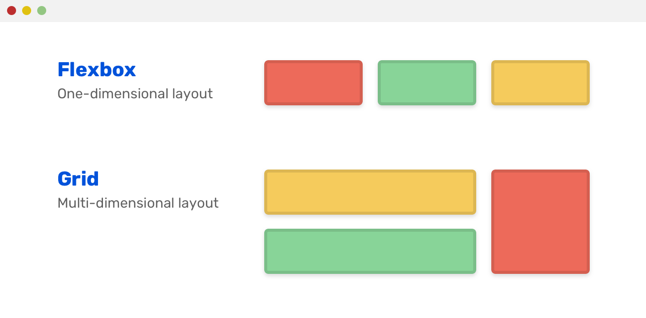
Before we delve into the properties, it's important to clarify the difference between flexbox and grid layouts since many beginners may find these two terms confusing. Flexbox and grid are both layout models used in CSS for organizing content on a web page, but they have distinct differences that are worth understanding.
Let's take a look at these two layouts.
As I mentioned earlier, we use Flexbox when we want to lay out items in a single dimension and Grid when we want to lay out items in two dimensions.
In Flexbox you can use either row or columns at a time while in Grid you can use both rows and columns at the same time.
Flexbox
<div class="main">
        <div class="flexible">Home</div>
        <div class="flexible">Read</div>
        <div class="flexible">Write</div>
       <div class="flexible">learn</div>
        <div class="flexible">play</div>
        <div class="flexible">eat</div>
    </div>
.flex-container {
  display: flex;
  background-color: bisque;
}

.flex-container > div {
  background-color: #f1f1f1;
  margin: 10px;
  padding: 20px;
  font-size: 30px;
}

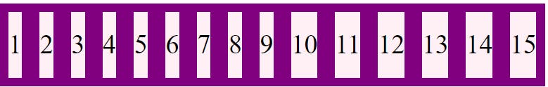
Grid
<div class="main">
        <div class="flexible">Home</div>
        <div class="flexible">Read</div>
        <div class="flexible">Write</div>
        <div class="flexible">learn</div>
        <div class="flexible">play</div>
        <div class="flexible">eat</div>
    </div>
.flex-container {
  display: Grid;
  background-color: bisque;
   grid: auto auto / auto auto auto auto;
   grid-gap: 10px;
}

.flex-container > div {
  background-color: #f1f1f1;
  margin: 10px;
  padding: 20px;
  font-size: 30px;
}
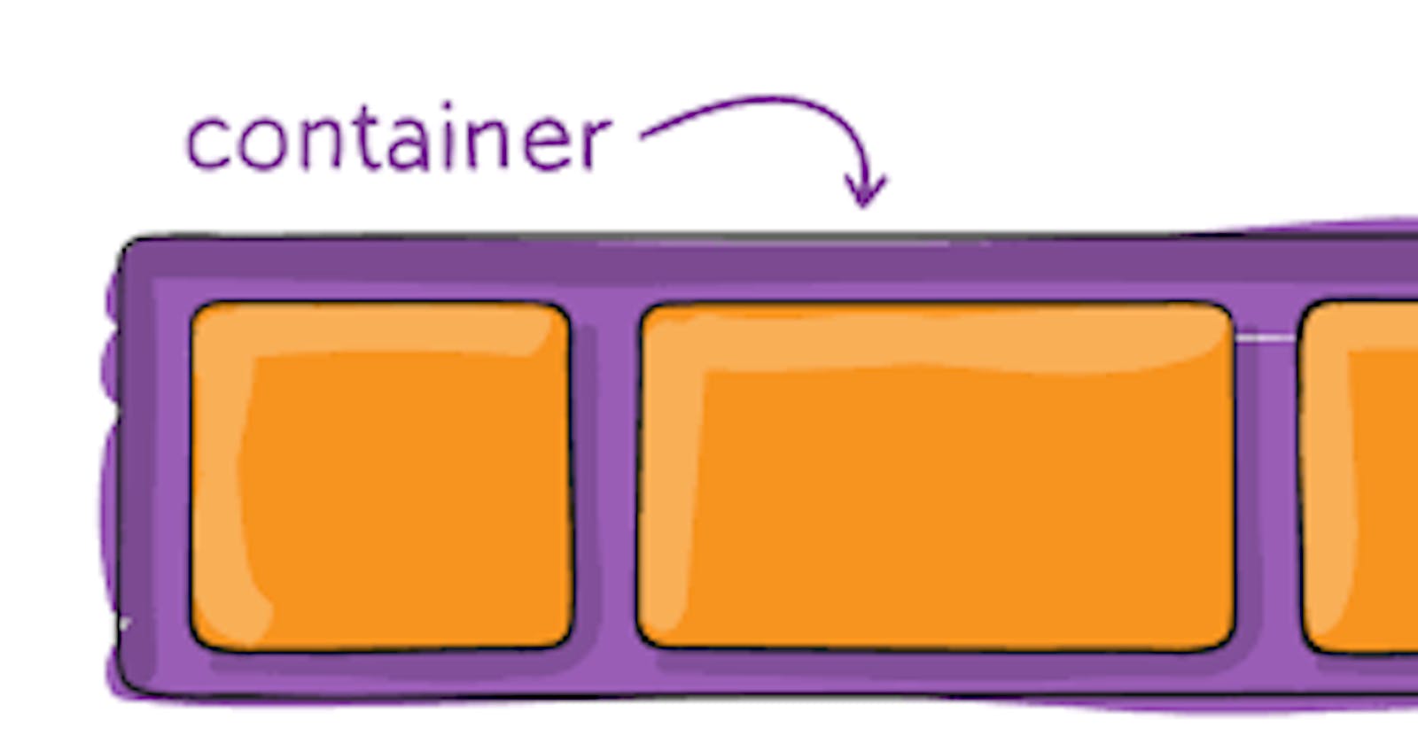
you can also consider this picture:
Flex-container properties
Flex-direction
If you want to stack your flex items direction your container requires. you can use this property.
Note: You can only use flexbox properties when you specify the display property to flex in your element.
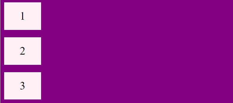
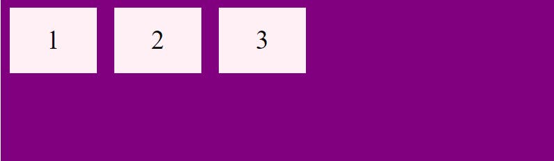
Row
- The value of
Flex-directionis already set torowby default.That is why we have not declared in the below code
.container {
  display: flex;
  background-color: purple;
}

.container > div {
  background-color: lavenderblush;
  width: 100px;
  margin: 10px;
  text-align: center;
  line-height: 75px;
  font-size: 30px;
}

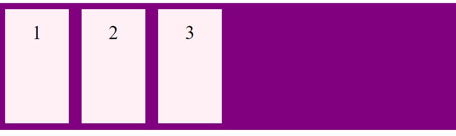
Column
To stack your Flexbox items vertically from top to bottom, you can use the flex-direction property and set it to column
.flex-container {
  display: flex;
  flex-direction: column;
  background-color: purple;
}

.flex-container > div {
  background-color: lavenderblush;
  width: 100px;
  margin: 10px;
  text-align: center;
  line-height: 75px;
  font-size: 30px;
}
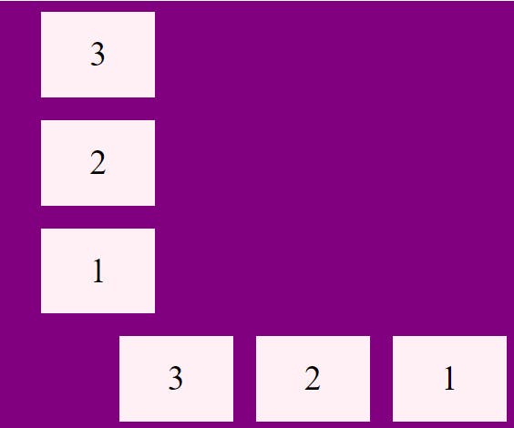
Row reverse and Column reverse
To stack the flex-items from bottom to top means in reverse direction you can use the value column-reverse and same for row you can insert the value to row-reverse
  .reverse-column {
    display: flex;
    flex-direction: column-reverse;
    background-color: purple;
    align-items: center;
  }

  .reverse-column > div {
    background-color: lavenderblush;
    width: 100px;
    margin: 10px;
    text-align: center;
    line-height: 75px;
    font-size: 30px;
  }
  .reverse-row {
    display: flex;
    flex-direction: row-reverse;
    background-color: purple;
  }

  .reverse-row > div {
    background-color: lavenderblush;
    width: 100px;
    margin: 10px;
    text-align: center;
    line-height: 75px;
    font-size: 30px;
    align-items: center;
  }
Flex-wrap Property
This property specifies whether the content should be forced onto one line or on multiple lines.
Wrap
By setting the value to wrap it wraps the flex-item
.wrap-container{
  display: flex;
  flex-wrap: wrap;
}

Nowrap
By default, when the flex-wrap property is set to nowrap, Flexbox items cannot wrap and are forced to stay on a single line
.wrap-container{
      display: flex;
    }
Wrap-reverse
- As we have learned about
row-reverseandcolumn-reverseearlier in the flex-direction same here we look atwrap-reverse.
.wrap-container {
  display: flex;
  flex-wrap:wrap-reverse;
  background-color:purple ;
}

The Flex-Flow Property
This is a shorthand property for setting both flex-direction and flex-wrap properties
.flow-container {
  display: flex;
  flex-flow: row wrap;
}
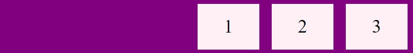
The Justify-content
This property is used to align the flex items horizontally.
Flex-end
- If you want to align your flex-items at the end of the container then you can set the value to
flex-end
.content{
display:flex;
justify-content:flex-end;
background-color:purple;
}
Flex-start
To position your Flex-items you can set the value to flex-start which is by default that's why I am not declaring
.content{
display:flex;
background-color: purple;
}

Space-around
To add space between Flexbox items, before, and after them, you can use the
justify-contentproperty with the valuespace-around.content { display: flex; justify-content: space-around; }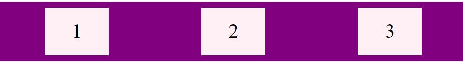
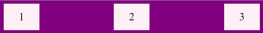
Space-between
To add space between only Flexbox items, you can use the justify-content property with the value space-between
.content {
  display: flex;
  justify-content: space-between;
}
The Align-items Property
As the Justify-content property is used to align the items horizontally, the align-items property is used to align the items vertically.
Flex-end and Flex-start
- The
flex-endandflex-startvalues work similarly inalign-itemsproperty as injustify-content, but they align Flexbox items vertically instead of horizontally
.flex-container {
  display: flex;
  height: 200px;
  align-items: flex-end;
  background-color: purple;
}

.flex-container {
  display: flex;
  height: 200px;
  align-items: flex-end;
  background-color: purple;
}
Stretch
The default value of this property is stretch which stretches the item to fill the container.
.flex-container {
  display: flex;
  height: 200px;
  background-color: purple;
}
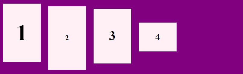
Baseline
- If you want to align the flex items respective to its baseline then you can baseline to the property
<div class="flex-container">
  <div><h1>1</h1></div>
  <div><h6>2</h6></div>
  <div><h3>3</h3></div>
  <div><small>4</small></div>
</div>
.container {
  display: flex;
  height: 200px;
  align-items: baseline;
}
Align-Content Property
The align-content property is used for multi-line flexible boxes. There is no effect on single-line .
The align-content property determines how flex lines are aligned along the cross-axis
If you have set the flex-direction to row which is by default then your cross-axis is the vertical line and If you have set the value column then your cross-axis is the horizontal line.
Remember,flex-lines not flex-items
note:No wrap No align-content
This property can have following value
flex-start, flex-end, center, space-between, space-around, space-evenly, and stretch
Centering Using Flex-Box
You can center your element using flexbox property which is the most appropriate way to center the div .
.center {
  display: flex;
  justify-content: center;
  align-items: center;
  height: 200px;
  background-color: purple;
}

Thank you for reading this article. I hope it provided some value. If you have any questions, feel free to ask me in the comment section.
For more,